
Through the world of blogging and social media, I have been privileged to meet and work with a lot of really wonderful people and local businesses. Last year, when I was hosting the “Fashion at your Pace” event with Pace Lighting, I was introduced to Victoria Baylor of Distinctly You: Image and Color Consulting. I am so happy that I had the chance to meet with her because she is a wonderful woman who is doing amazing things in our local community and beyond.


As I mentioned, Victoria is the owner of Distinctly You: Image and Color Consulting. Through her business, she works with women and men teaching them about the importance of color and how to best dress your body in the workplace. A lot of people are clueless about what looks best on their body so Victoria works with them, teaching them to pick pieces that will accentuate their best features and really help them to stand out. Much of what she does is a custom color analysis. Through this service, Victoria goes through the different color palettes and works with you to determine what colors look best with your skin tone, eye color, and other features. I was privileged enough to meet with her and had her do a Custom Color Analysis on me.

Throughout history, color has been used as a symbol for different things. When you think of the color red you probably think of love or passion. When you think of the color green, many people think of wealth or money. The question though is how do these colors affect people when they wear them. Unfortunately, not everyone can wear every color. I am sure you have realized by now but some colors probably look terrible on you. I know for me personally, I look awful in bright yellow. It washes me out and does nothing for my complexion. The same can be said for most “electric” colors. Neon pinks and greens do nothing for me so I have always tried to avoid those colors. While I knew those colors were not for me, I wanted to know if their were other colors that I should not be wearing. I also wanted to know what colors looked best on me.
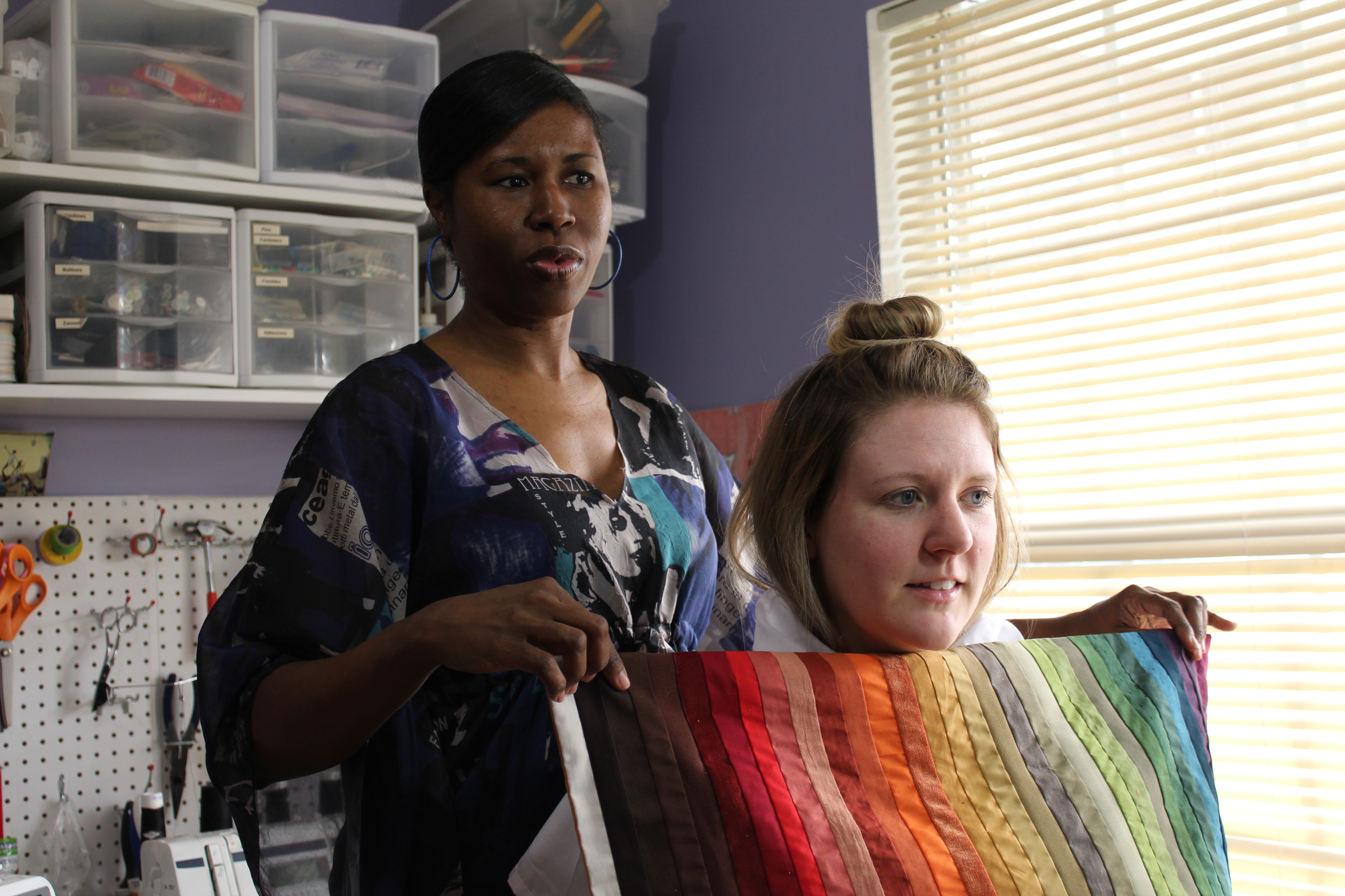
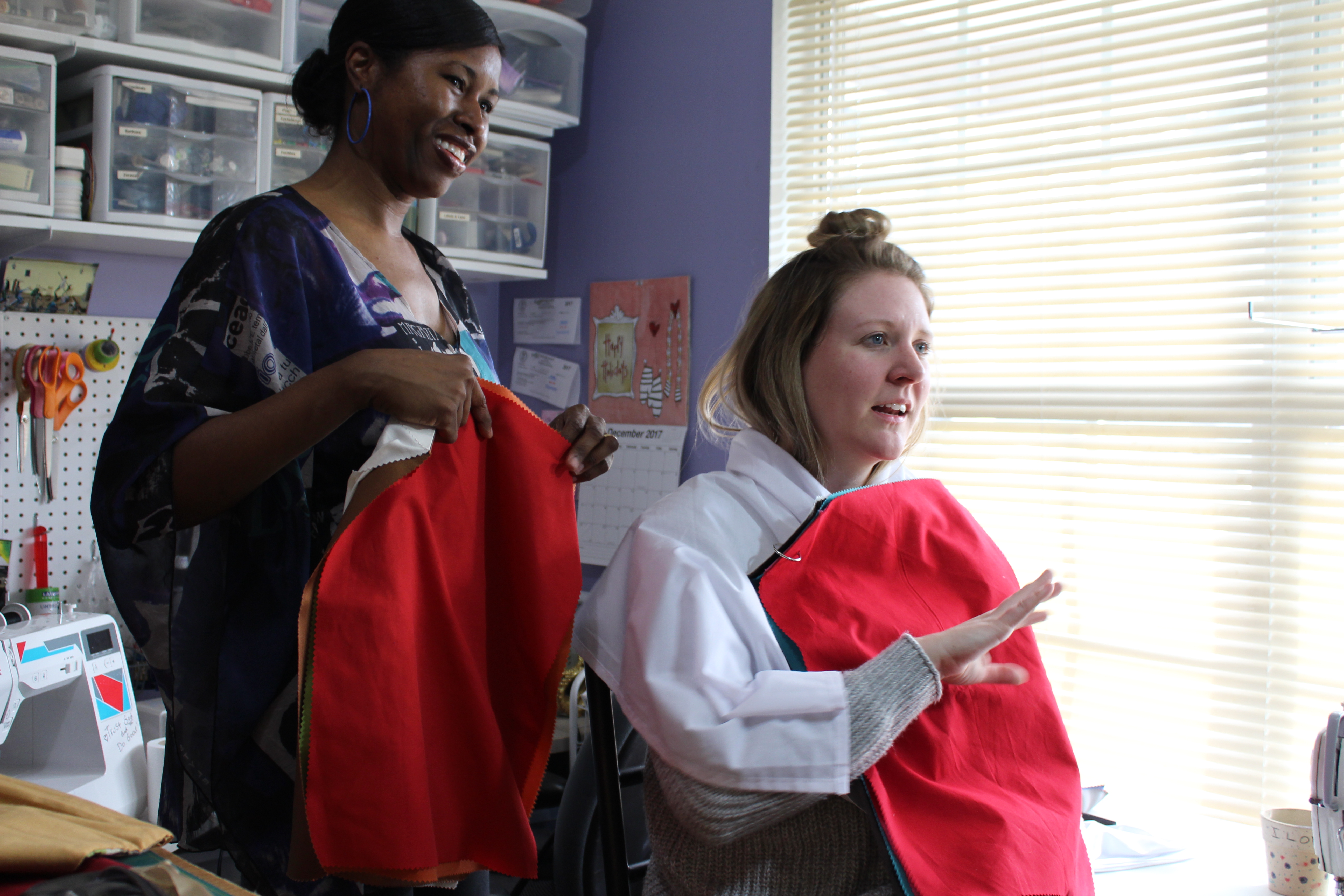
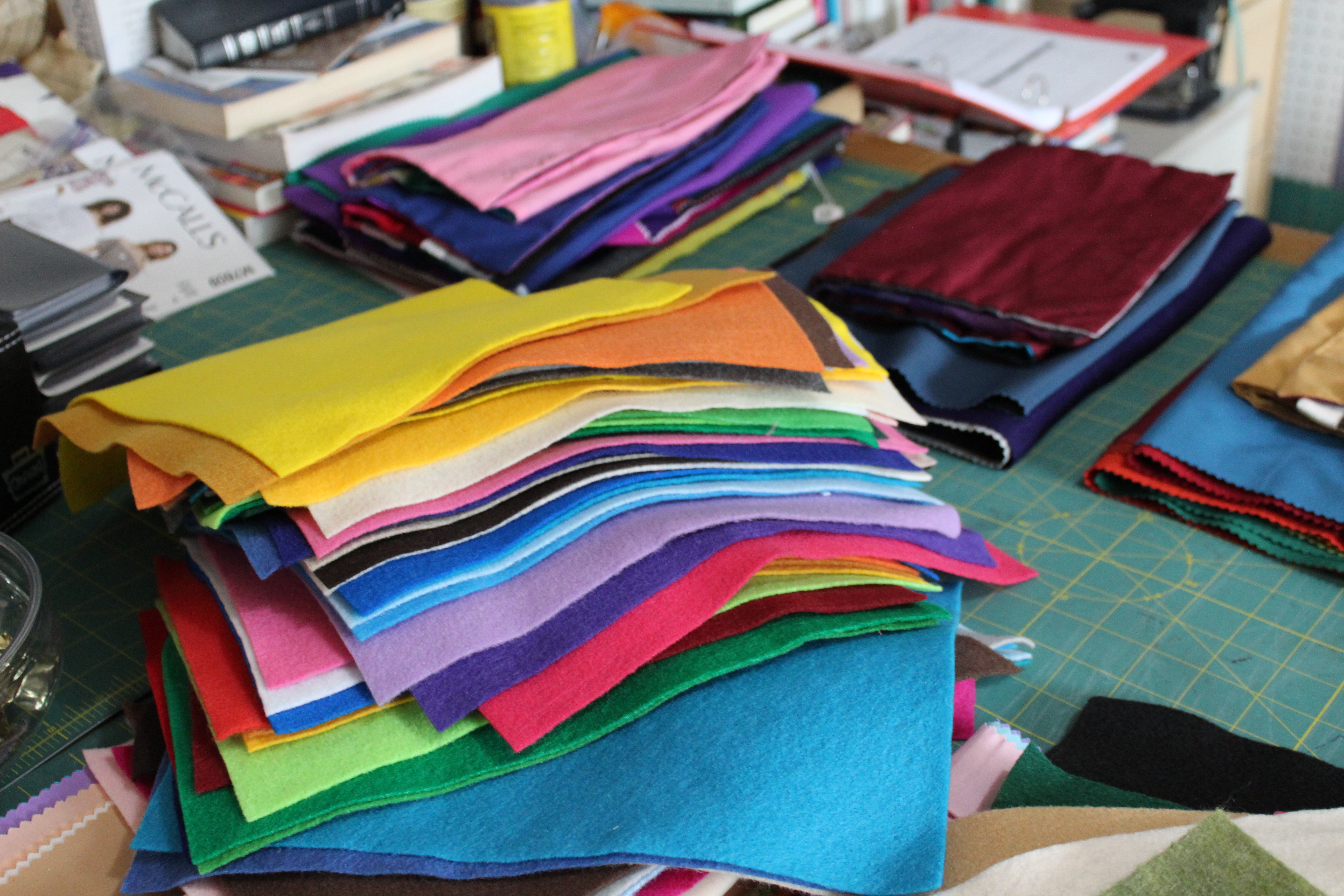
Through a sampling of meticulously made fabric swatches, Victoria and I were able to try a variety of colors with my skin tone. Using only a white sheet to cover my outfit and a face without makeup, Victoria and I went through all of the seasons of colors. It was honestly really difficult at first because, as boastful as it sounds, most colors looked good against my skin-tone. Of course those neon’s did nothing for me, but most of the other colors didn’t seem to cause any problems. We finally figured out that I could best be labeled as “Muted.” According to the International Image Institute in Toronto, Canada, “The muted palette is midway between Summer and Autumn, and has the colors that both palettes share. Although you are more neutral in your undertone, you may be slightly more warm or more cool, which will help indicate your “home” season. This will help to further define your palette.”


It was such a great experience and, even though I have a love of clothes and fashion, I still learned a lot about myself and the colors that I should be wearing. It really helps me to hone my shopping, especially when I am looking for something specific, to find the perfect piece, best suited for my body in all ways.
I encourage you to check back later this week because Victoria well be back with a guest blog post, furthering explaining what she does and the services that she offers. If you are local to Savannah, I encourage that you check her out. She is truly wonderful woman that can help you a lot in the face of a wardrobe crisis!


Disclaimer: I received a complimentary color consultation in exchange for a blog post. All opinions are my own.